Increasing acquisition

HeyBryan

App design screen
App design screen
App design screen

Introduction

HeyBryan is an app that connects home service experts with anyone who needs tasks done around the home.

My role

I was tasked with increasing expert acquisition to improve our north star metric tasks completed.

What I did

  • Research
  • Interaction design
  • Product vision
  • Prototyping
  • User testing
  • Problem

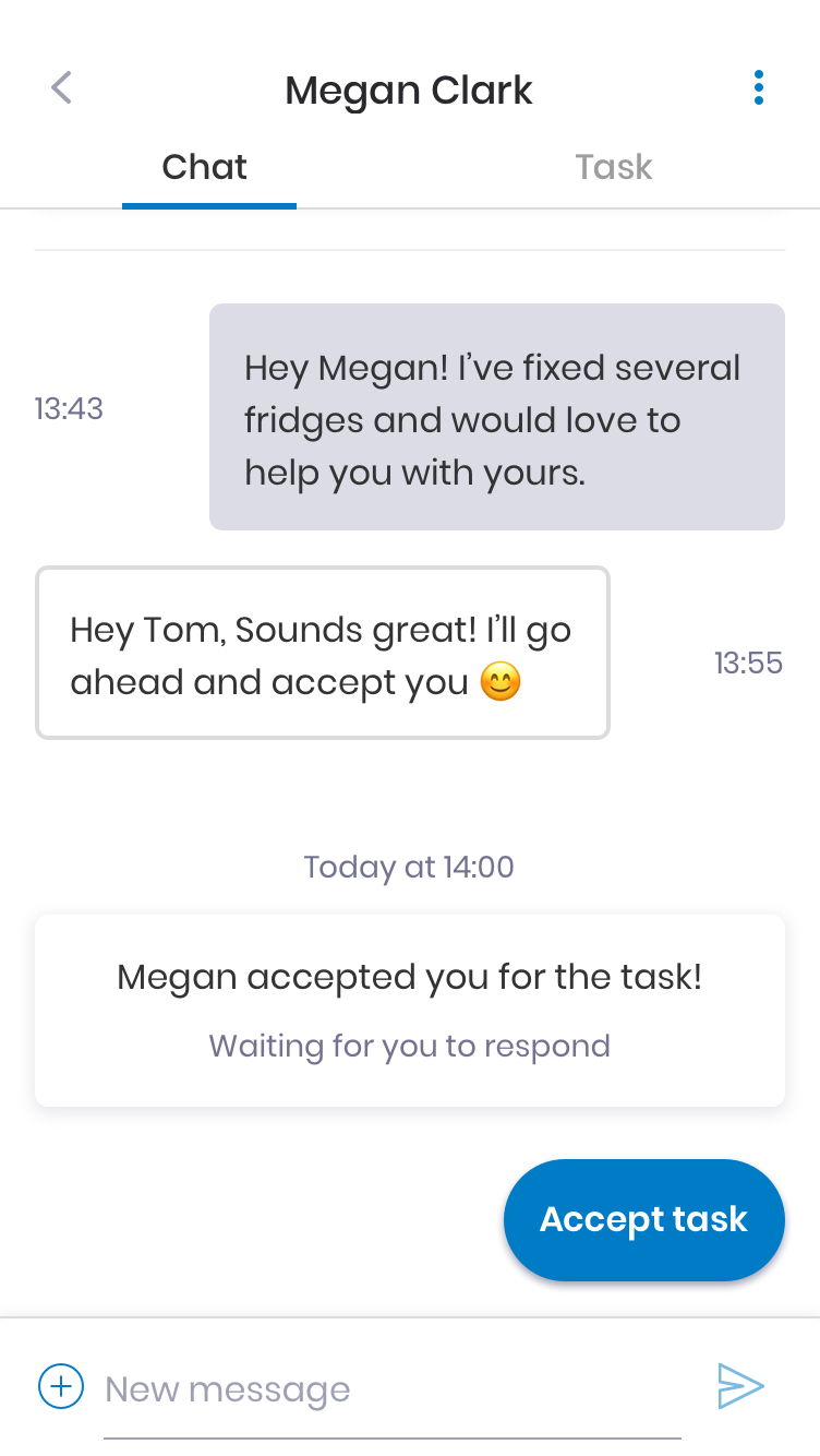
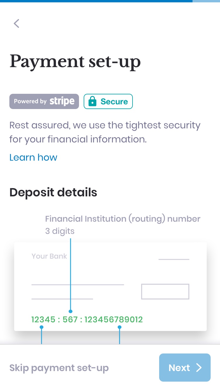
    44% of experts drop off during sign-up when asked to enter their payment information in order to get paid for work.

    Pain points

    Experts didn’t trust the brand enough to supply their banking info
    Experts unsure if banking info can be used to withdraw money from their accounts
    Experts didn’t like being redirected to a website to enter banking info

    Goal

    Get experts to enter their payment information and complete sign-up.

    Success metrics

    • Experts completing sign up
    • Payment information submitted
    • Tasks completed

    Solution

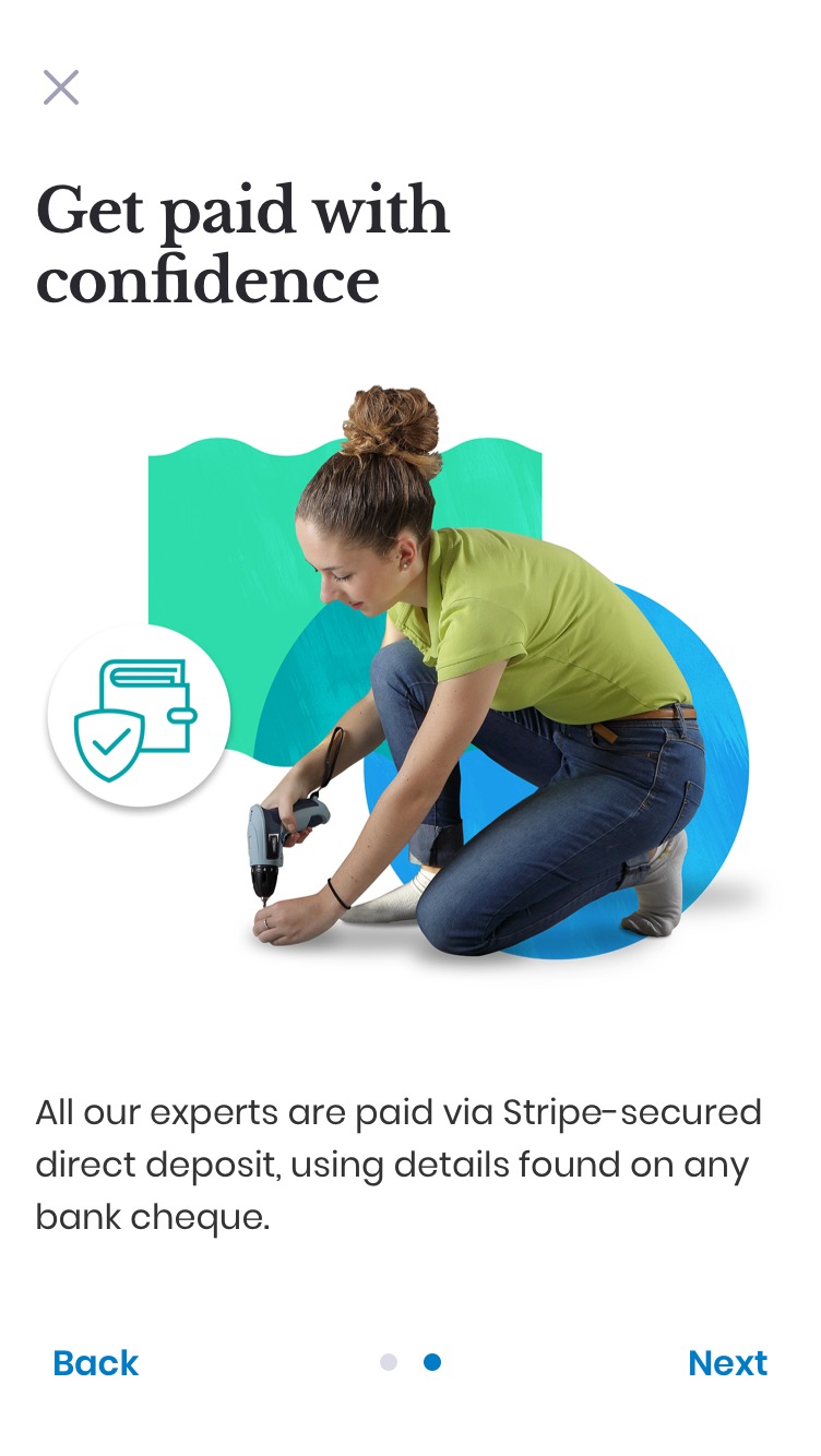
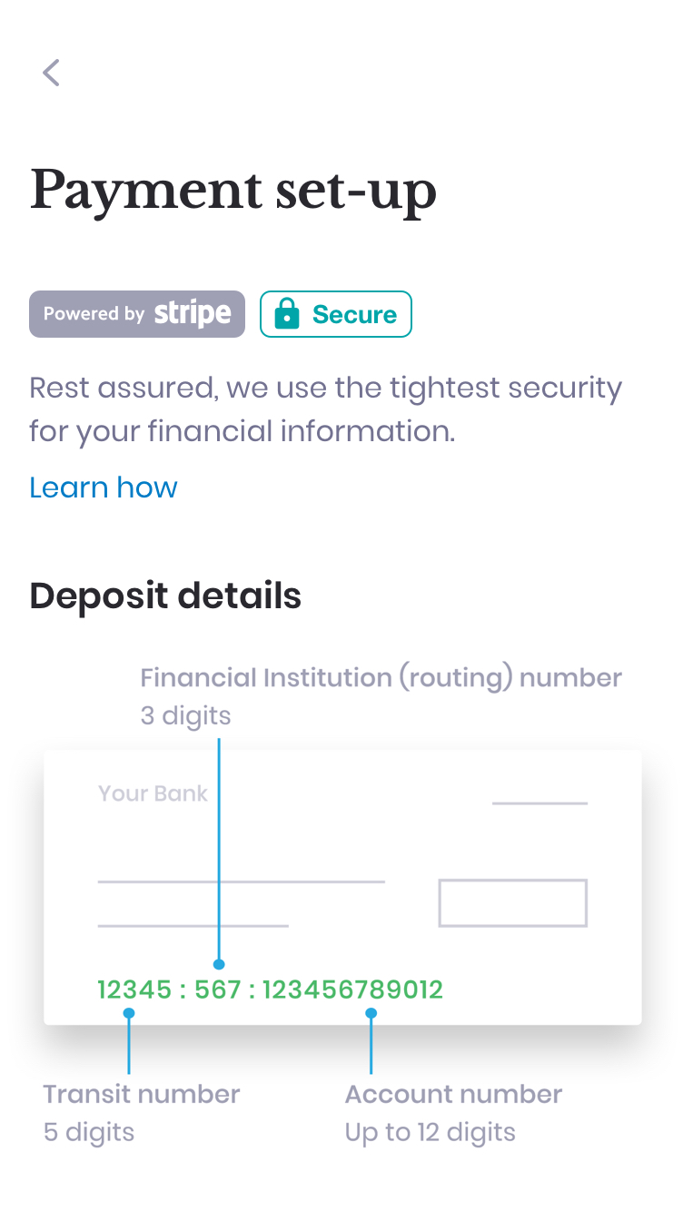
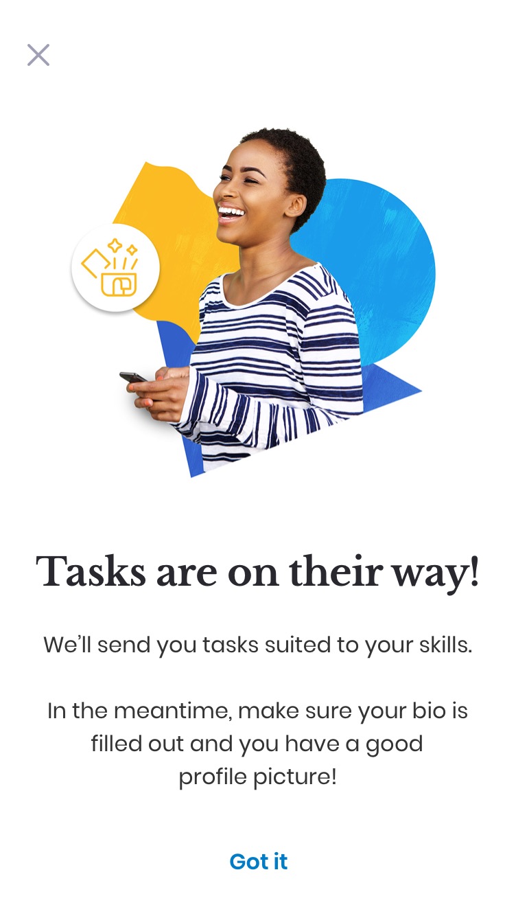
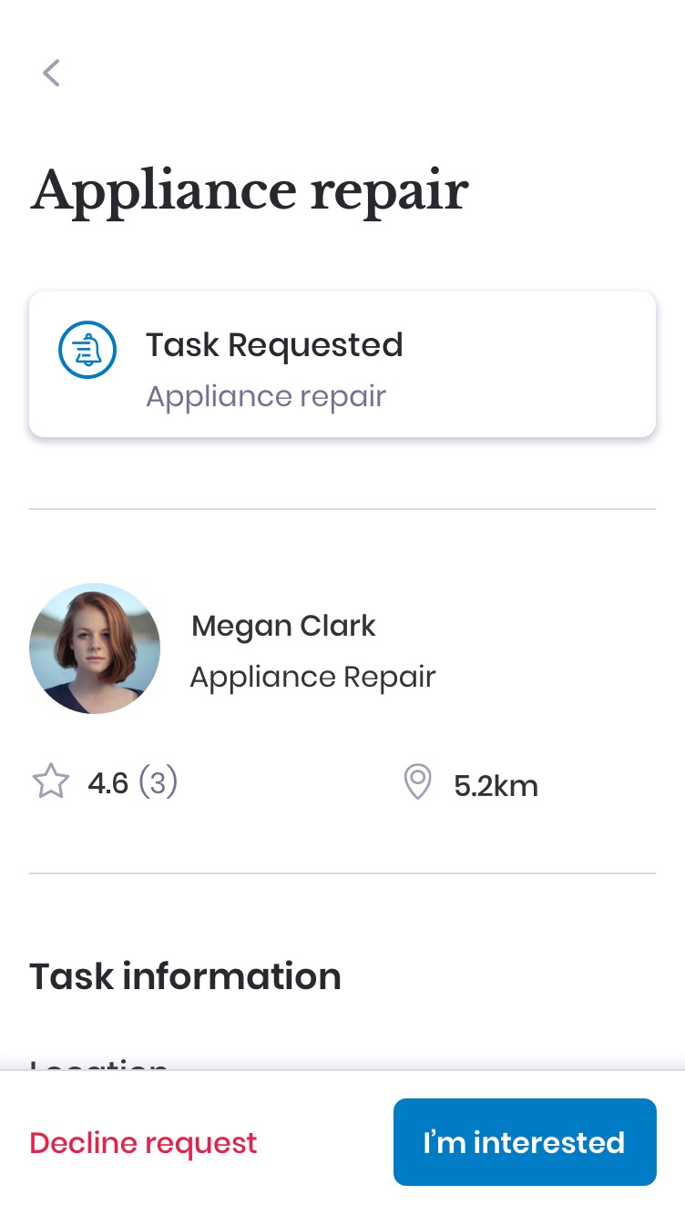
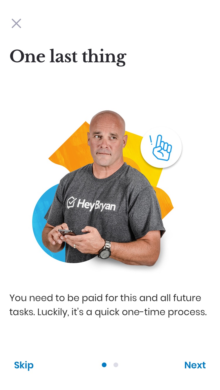
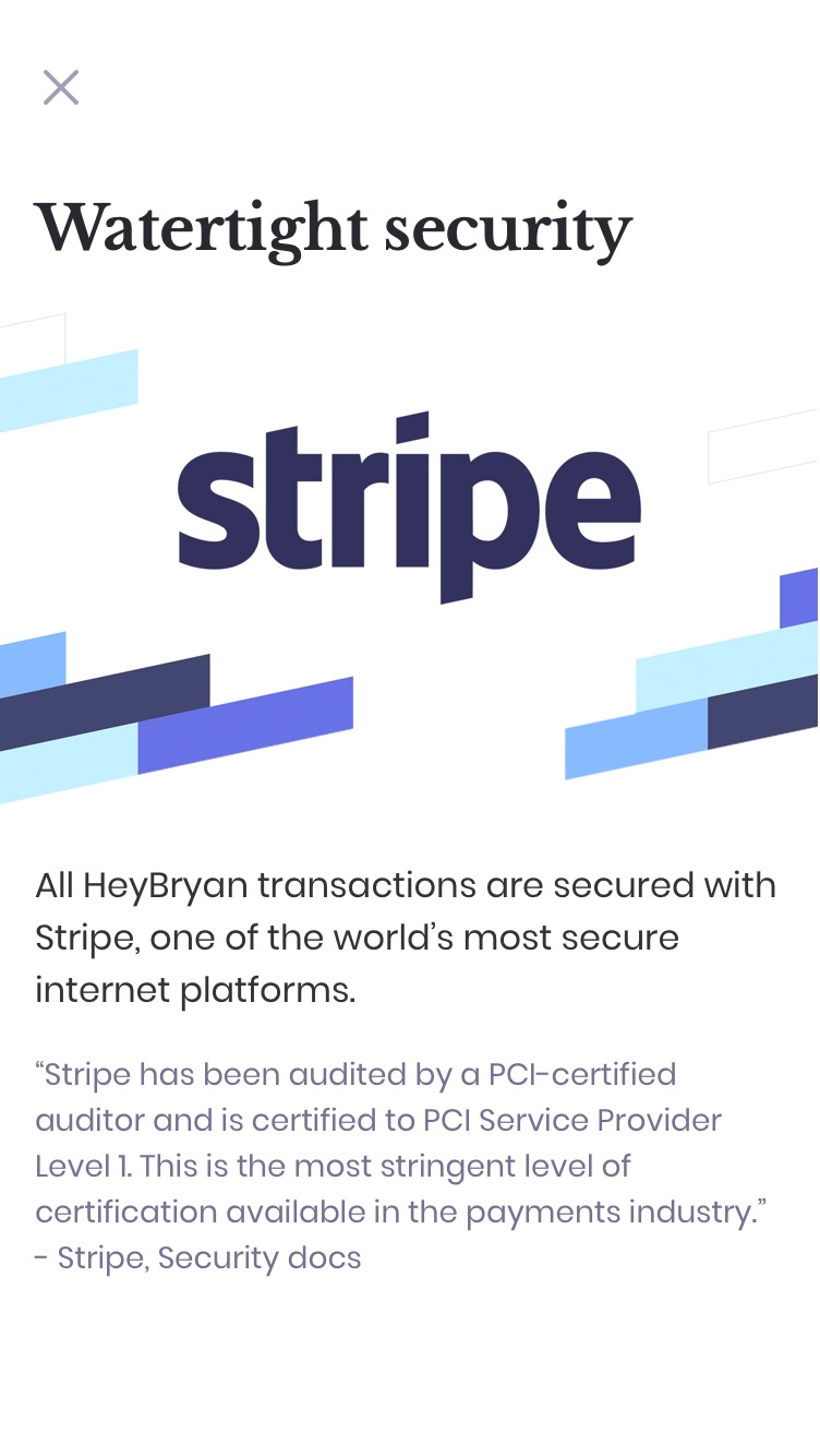
    Optimise the sign-up flow enabling experts to skip the initial banking form, communicate how we use their information, and allow them to submit payment information after receiving their first task.

    Impact

    • 25% increase in expert acquisition
    • 18% increase in submitted payment information
    • 7% increase in tasks completed
    Final prototype

    Process

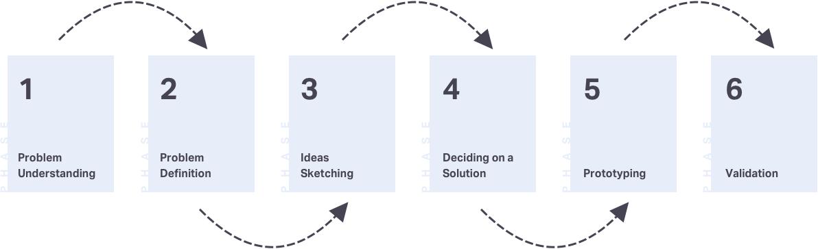
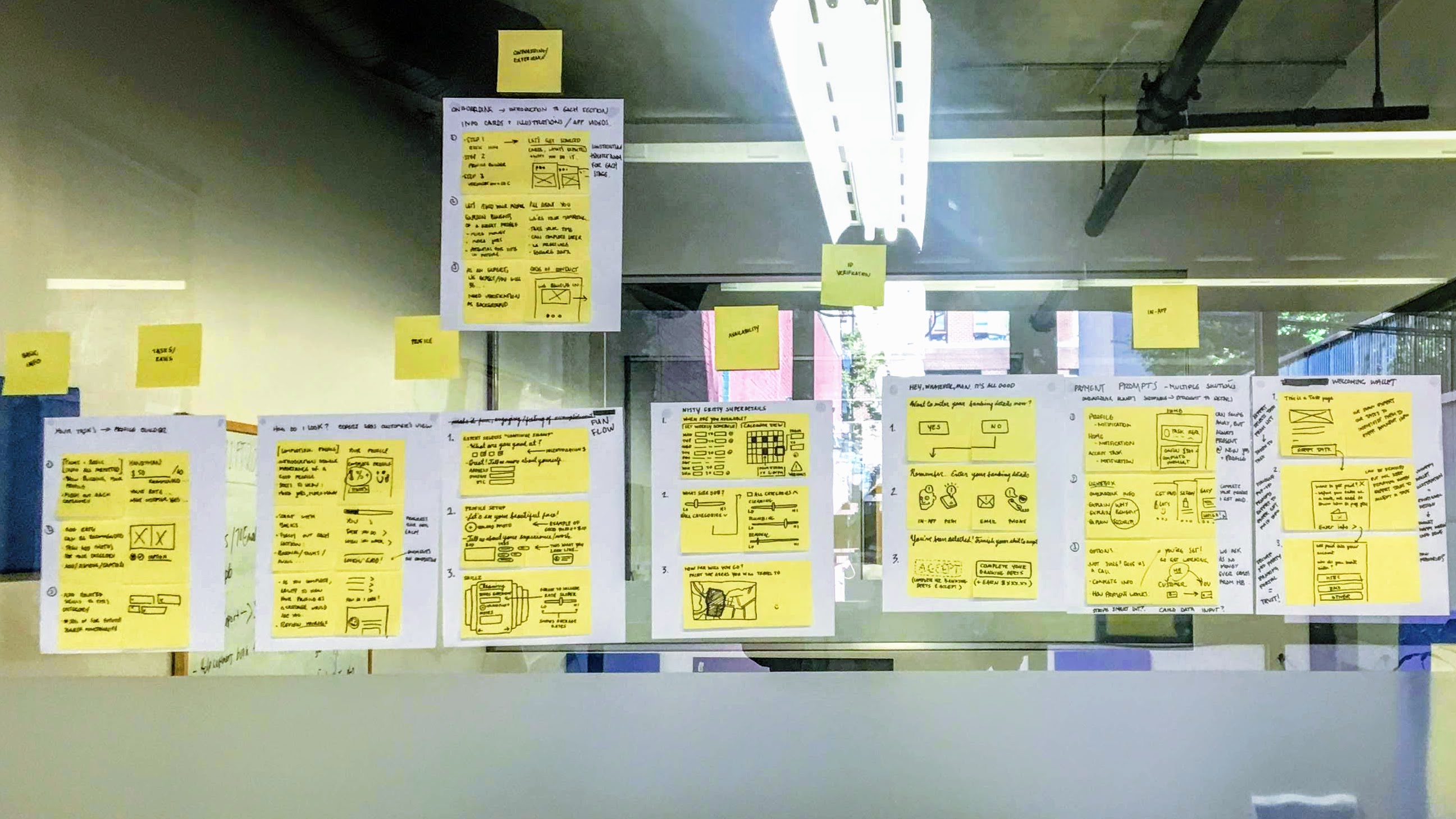
    I used a short Google Design Sprint process to better understand user needs and explore ideas as potential solutions.

    The process follows six phases: Understand, Define, Sketch, Decide, Prototype, and Validate.

    Google Sprint Process
    Design sprint process

    Phase 1: Understand

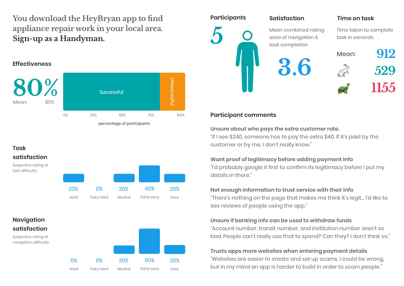
    I carried out stakeholder interviews, user interviews, and usability testing of the sign-up flow to understand the problem.

    Summary research
    Key findings from user testing

    No brand loyalty

    "There’s nothing that makes me think the service is legit. How do I know I can trust you with my baking information?"

    Confusion around how we pay experts

    "People can’t use my deposit details to spend, can they? I'm not really sure.”

    Distrust in website sign-up

    "Websites are easier to create and set up scams. An app is harder to build.."

    Phase 2: Define

    In this phase, I analysed findings and reframed problems into design opportunities.

    Problem definition

    HMW questions helped to identify the main problem areas to focus design efforts on.

    • How might we improve our loyalty as a brand?
    • How might we come across as a legit company?
    • How might we accept payment registration in the app?
    • How might we communicate that we use baking information to pay experts?

    How might we ensure experts feel comfortable entering their payment information?


    Phase 3: Sketch

    Ideating possible solutions for how we might ensure experts feel comfortable when entering their payment information.

    Crazy 8's sketch
    Crazy 8's solution sketch

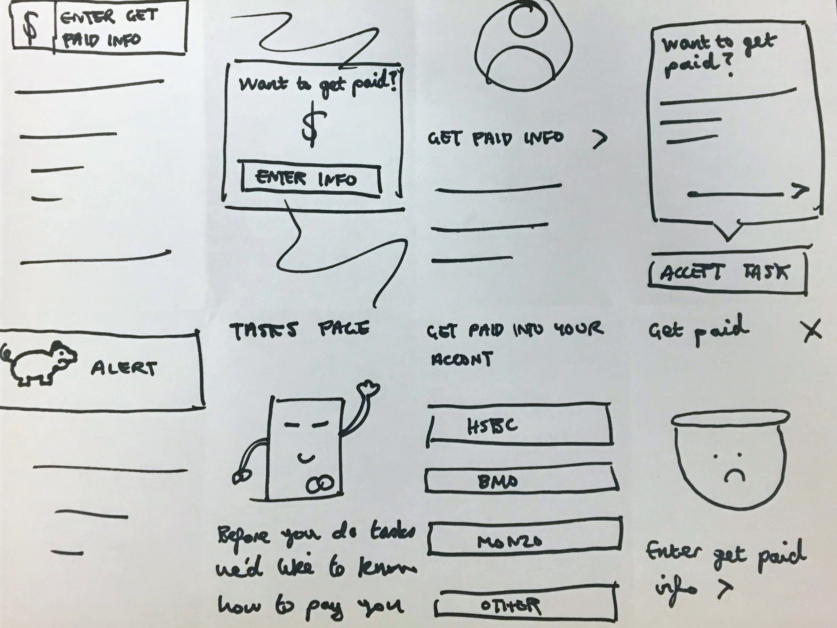
    An idea where users skip the initial payment details step and set up their account using secure banking integration.

    This rapid sketching process allowed us to push beyond first ideas and generate a wide variety of solutions.

    Idea sketch
    Idea sketch
    Solution sketches

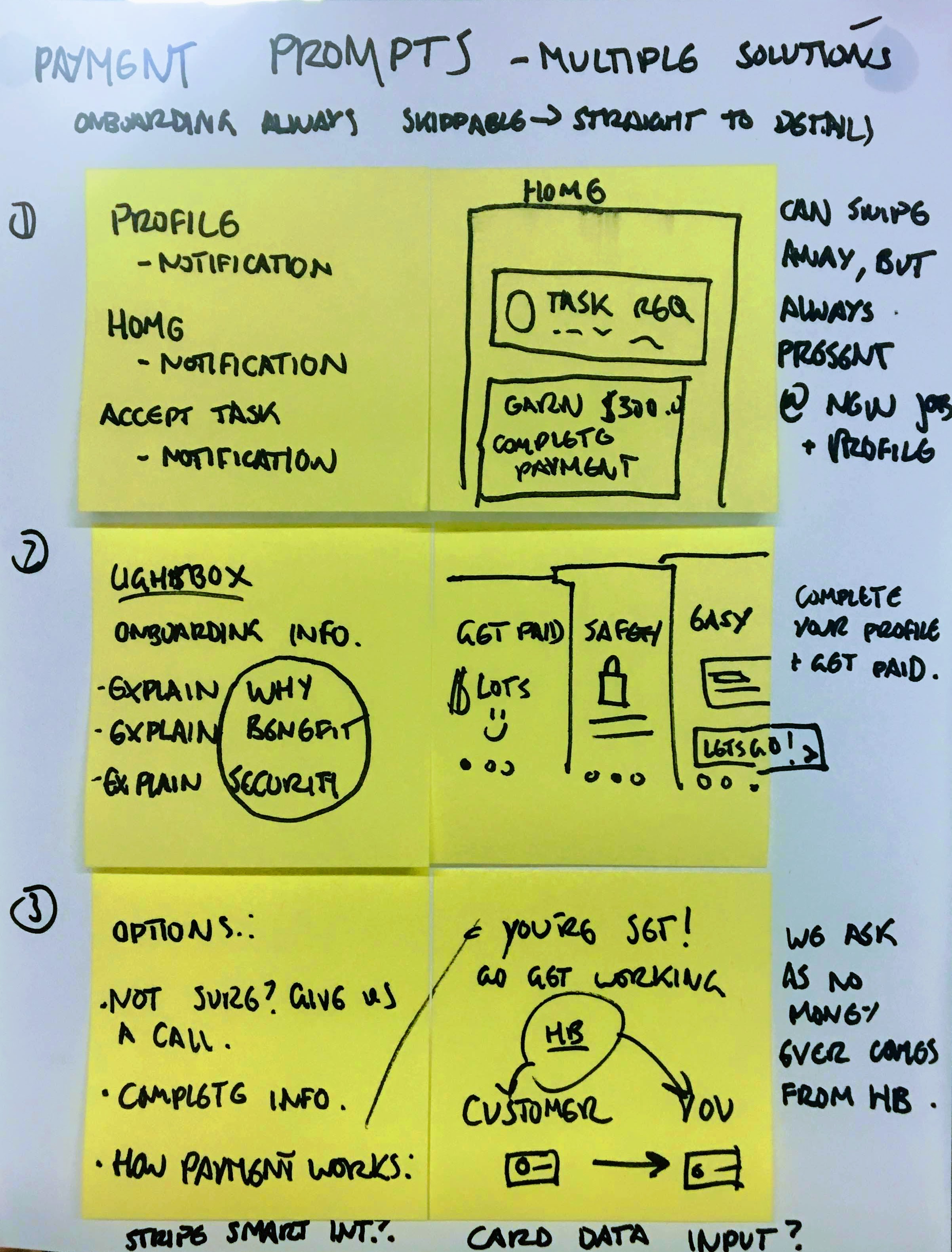
    Fleshed out ideas for communicating how we use experts' payment info and setting up their account using secure banking integration.

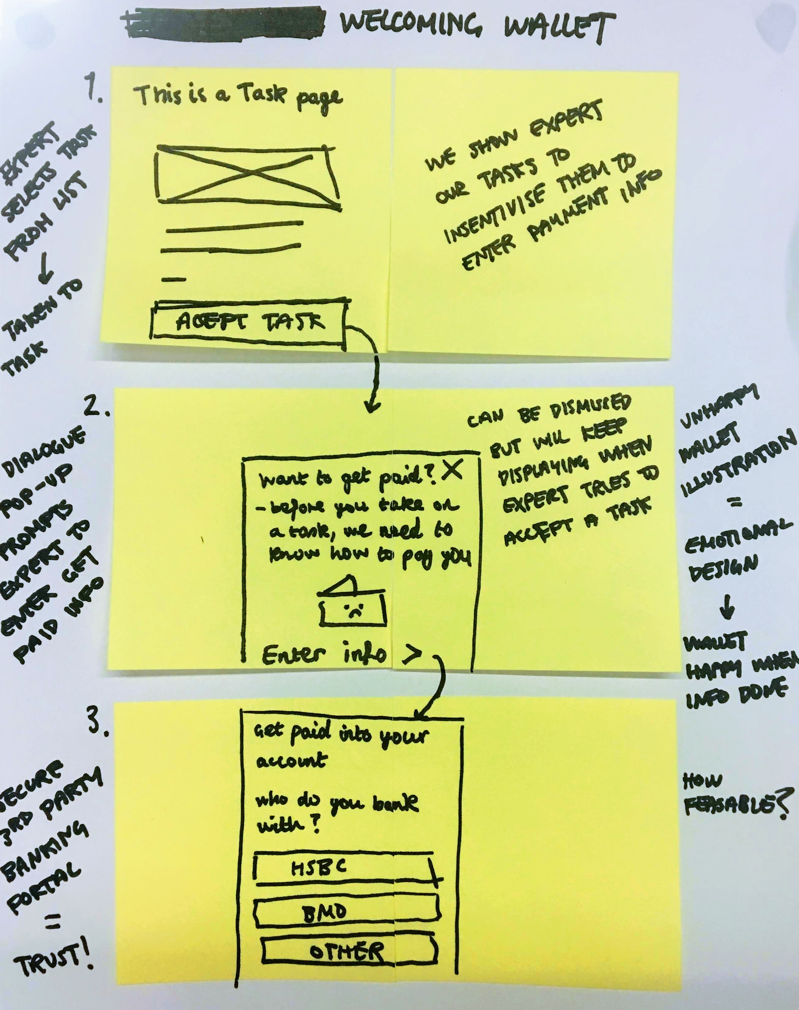
    Here we expanded on our best crazy 8's idea in a storyboard format.

    Phase 4: Decide

    We decided on the best features for the solution by combining the winning ideas:

    • Entering payment info in the app
    • Allowing users to fill in payment info later
    • Explaining that payments are secured via Stripe
    • Surfacing payment step when expert receives their first task
    Google Sprint Process
    Voting on ideas to storyboard

    Phase 5: Prototype

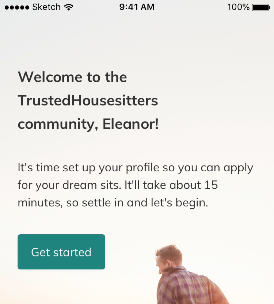
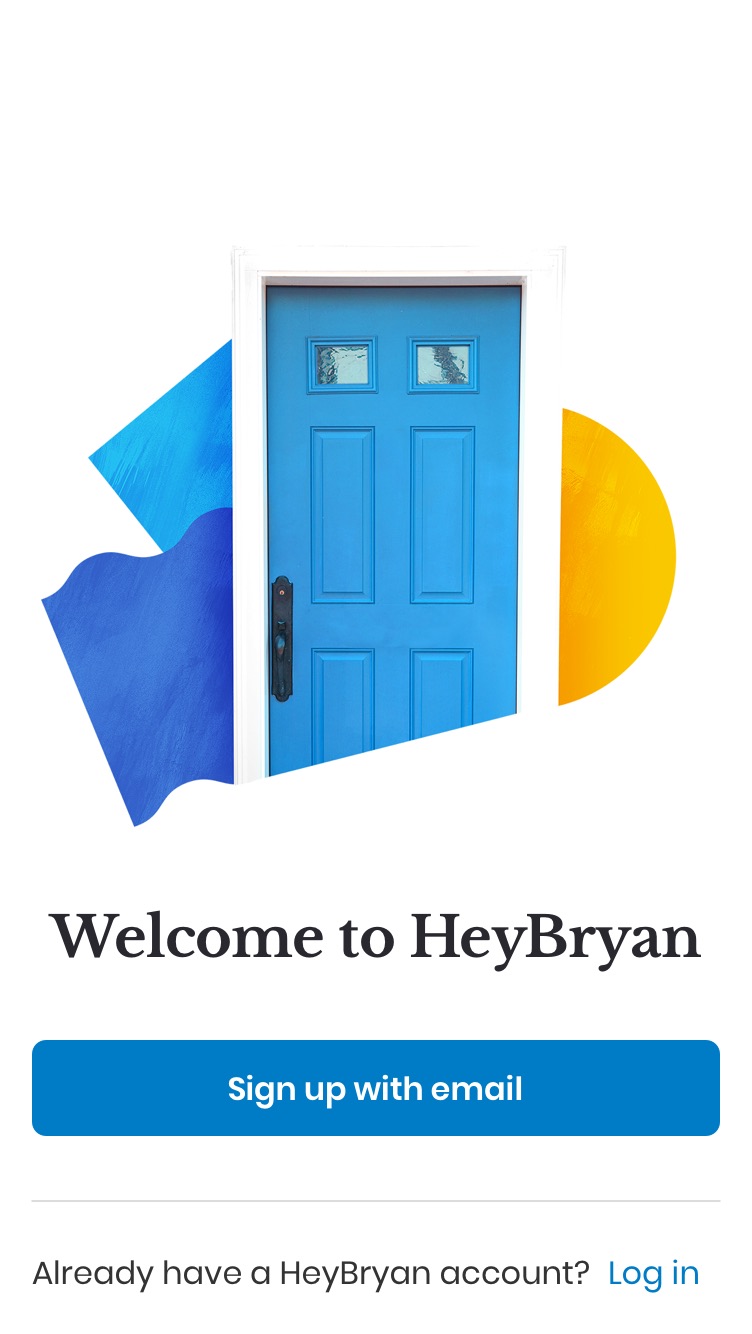
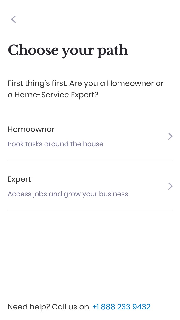
    Using our Design System I prototyped the solution.

    Rapid prototype

    Phase 6: Validate

    We went out and recruited handy-people to test the prototype.

    Summary of findings

    😄

    • Liked seeing how the app worked before entering lots of information
    • Liked knowing that Stripe handles money transactions
    • Liked being able to supply payment information later
    • Majority described the prototype as:
      • "Simple navigation"
      • "Quick and easy sign-up process"

    🙁

    • CTA button to skip the initial payment button not surfaced well enough
    • Some confusion around what Stripe is and how it works

    App design screen
    App design screen
    App design screen
    App design screen
    App design screen
    App design screen
    App design screen
    App design screen

    Outcome

    The short design sprint allowed us to understand the problem and validate our solution before developing any features.

    Expert acquisition and submitted payment information metrics have increased and enabled more homeowners to have their tasks completed as a result.

    Learnings

    • Involve customer champions in sprint phases to ensure solutions are catered to user needs. For example, we assumed Stripe would be easily understood by our experts whom some aren’t tech-savvy.
    • Proto-personas or empathy mapping could have provided a better understanding of our users.
    • Get more buy-in to validate design changes before development begins.

    arrow-up icon