University project
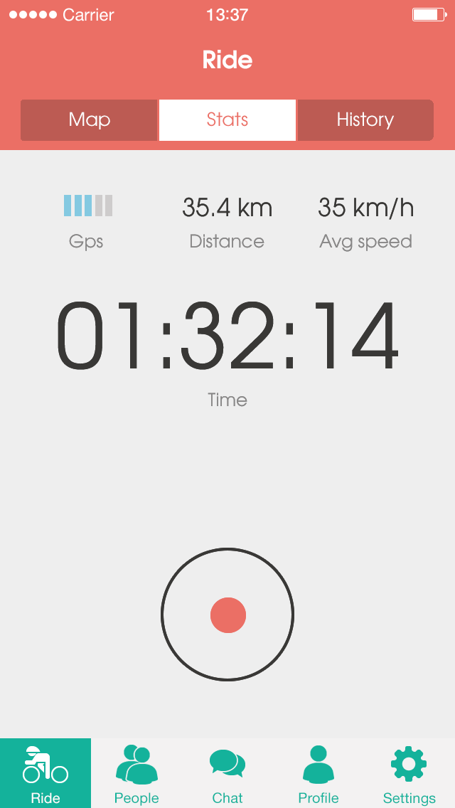
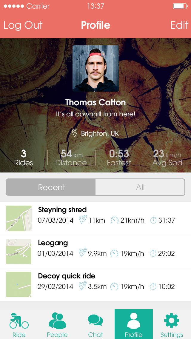
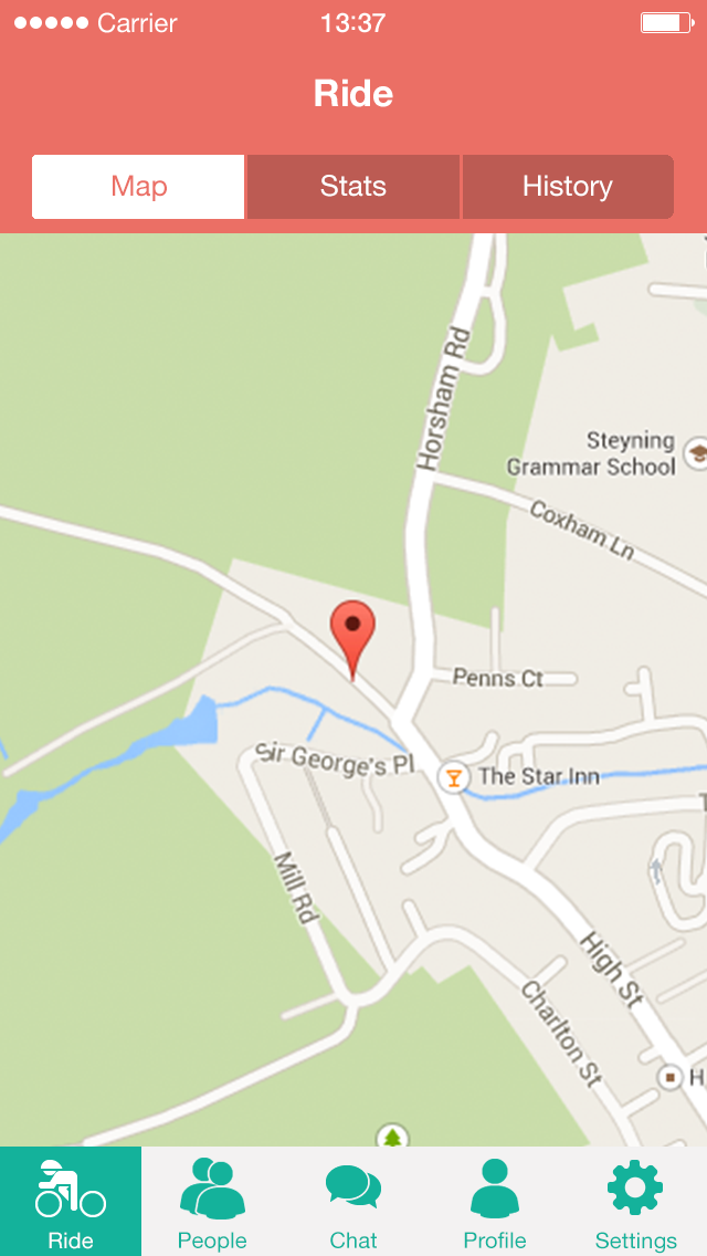
Switchback is an app that helps mountain bikers share their riding experiences. Users can track their rides, publish trail information, and organise events like races or dig days.
I worked through most of the product design process and developed a prototype for iOS using PhoneGap.
A user-centred design process was used to understand user needs and tailor solutions to meet their specific requirements.
Analysis
Determine the purpose of the product and the target audienceDesign
Design solutions to user needs based on research insightsEvaluate
Carry out user-based assessment to evaluate designs against requirementsIterate
Use knowledge gained from evaluation to improve design solutionsAnalysis
Determine the purpose of the product and the target audienceDesign
Design solutions to user needs based on research insightsEvaluate
Carry out user based assessment to evaluate designs against requirementsIterate
Use knowledge gained from evaluation to improve design solutionsSeveral research methods were used to understand users and the problem space.
I conducted user interviews, blog studies, and competitor analysis to gather insights. Analysis and a focus on empathy helped dissect the problem. In the synthesis phase, I pieced the problem back together to arrive at a problem definition.
Blog studies revealed cycling apps such as Strava could harm mountain biking culture. I wanted to identify other patterns and deep dive into the issues uncovered from the study.
“Don’t go out for a ride and hit the same trail three times because you’re trying to get a KOM. That’s not riding. It’s just dumb.”
Flow mountain bike“Don’t do Strava runs on weekends. Nobody cares if you are having the run of a lifetime. Pros don’t ride like dicks, and neither should you.”
NSMB“Take for instance the geniuses who are riding illegal mountain bike trails, then posting their Strava segments for park rangers to see.”
Bike MojoIn the interviews, I allowed participants to talk openly about their experience with cycling apps then focused on specific problems related to the blog study findings.
Using affinity mapping, I sorted research findings into themes to identify patterns.
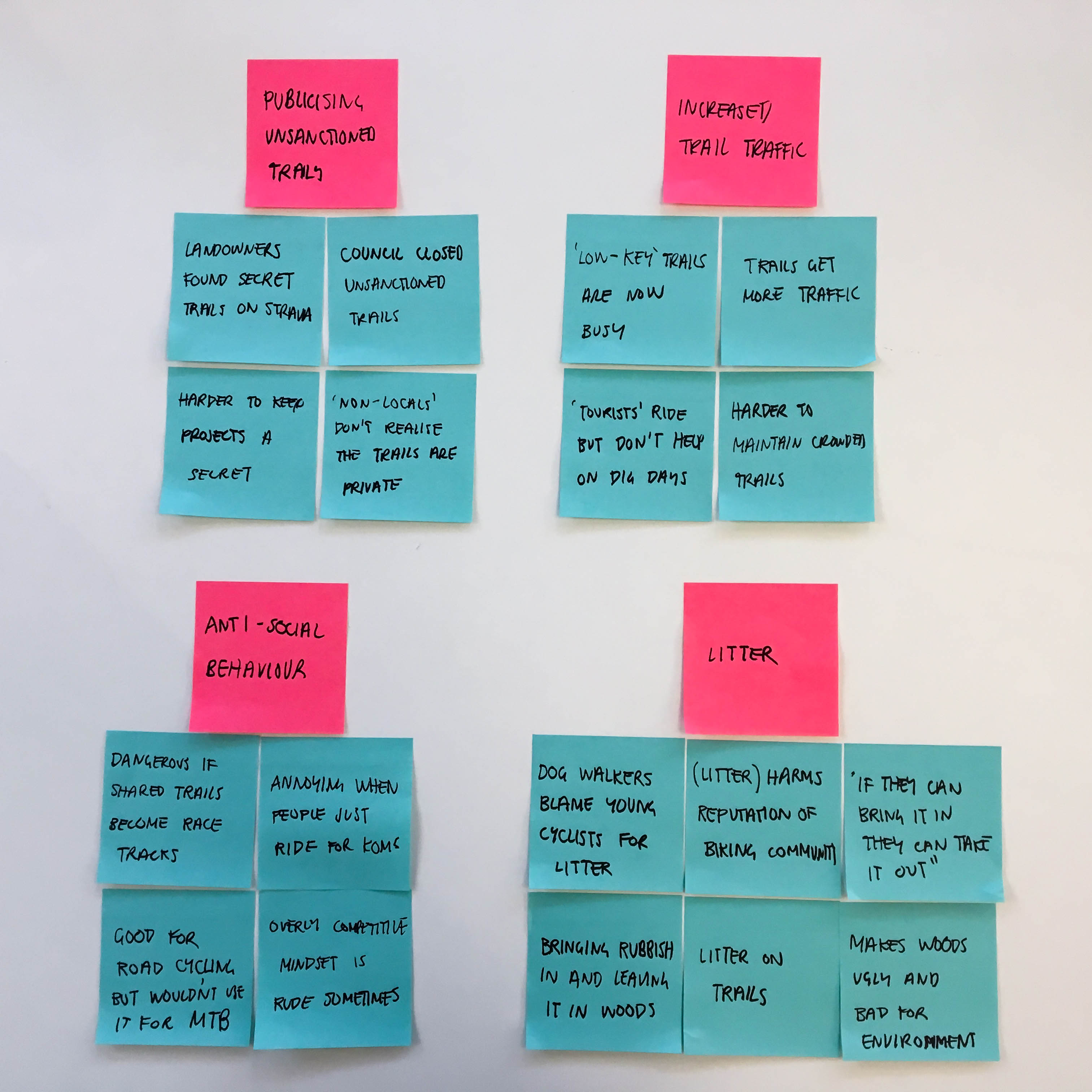
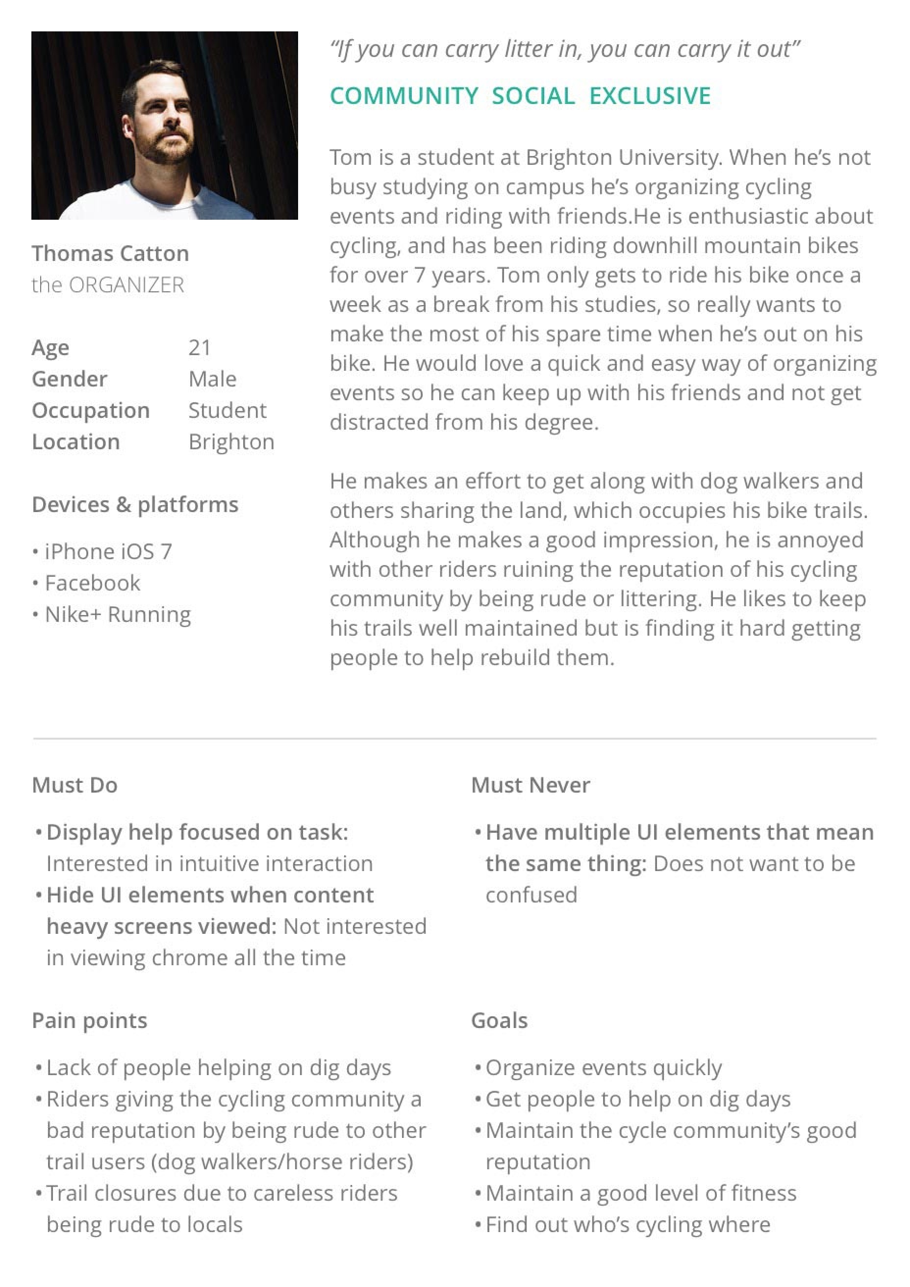
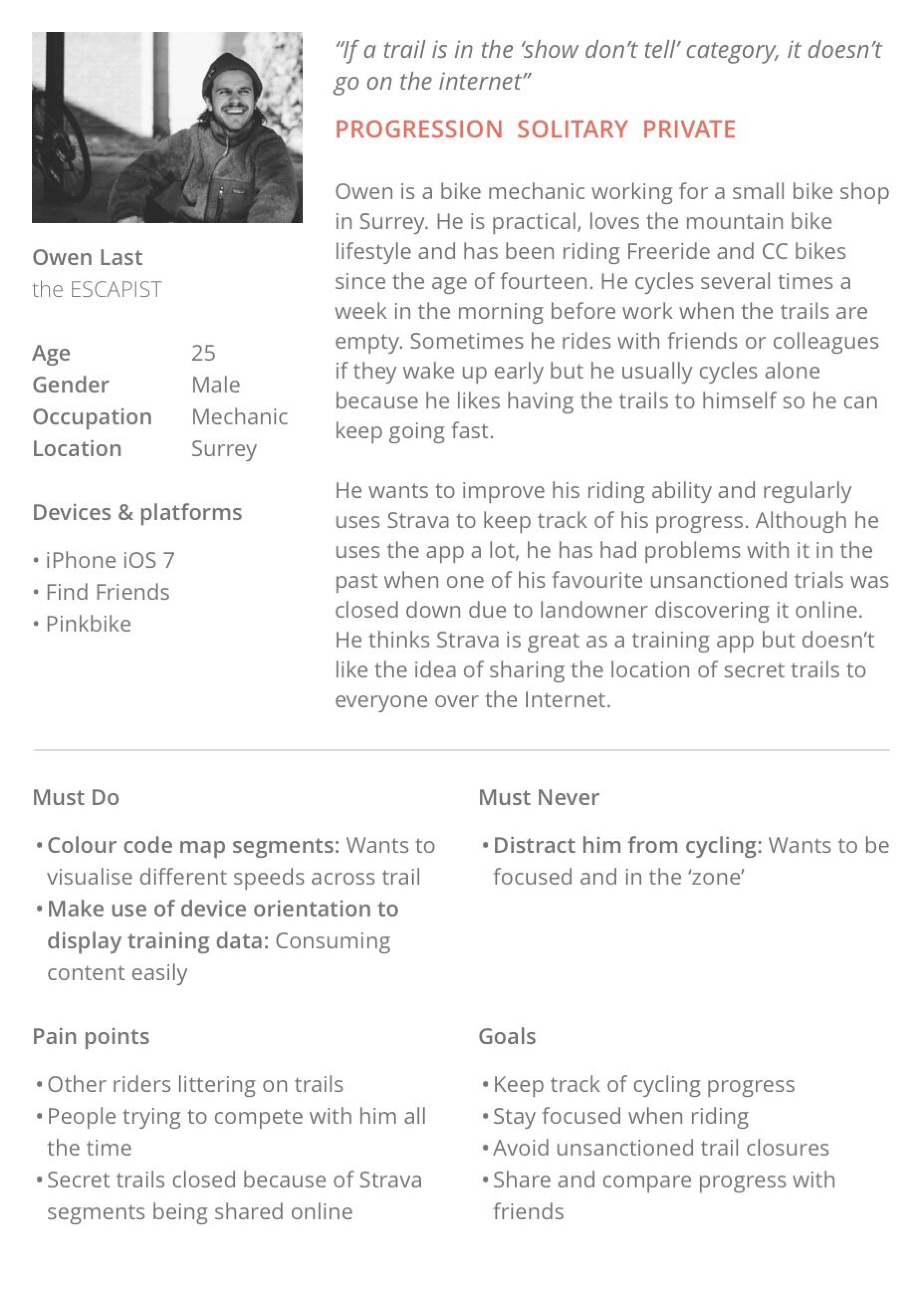
Patterns and observations helped with empathy mapping and informed two personas. Each persona represents the pain points and goals of the potential users who were studied.
I created HMW questions to reframe the patterns into potential opportunities and identify the main problem area to focus my design efforts on.
How might we prevent the closure of unsanctioned bike trails?
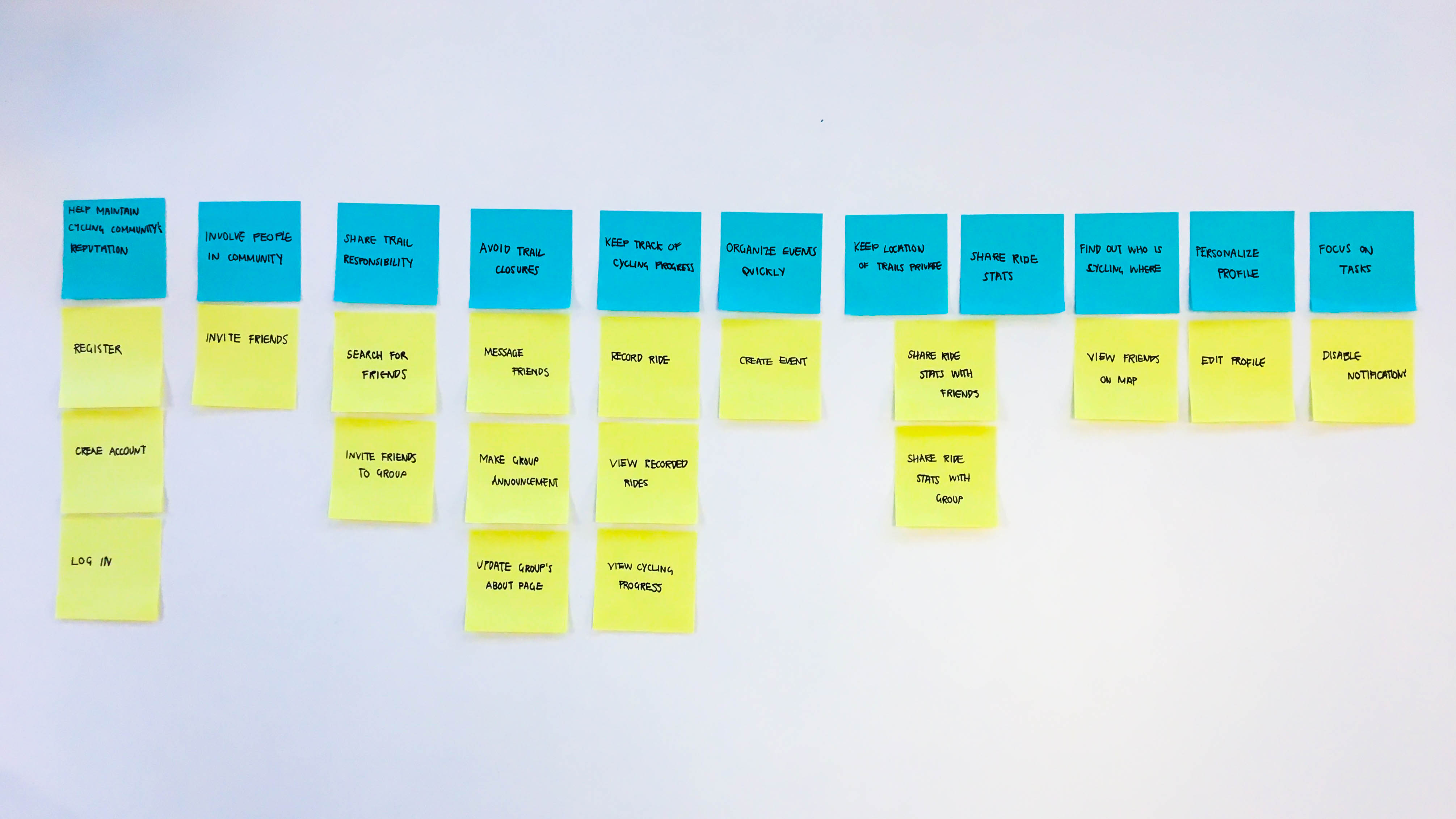
Mapping user stories helped identify the scope of the project. The chosen stories included features that I could create in the given time frame and would still give meaning to the app.
After discovery, I went on to ideate possible solutions.
Sketching allowed me to work through several ideas before committing to a solution. The chosen ideas were then developed into wireframes to flesh out the experience.
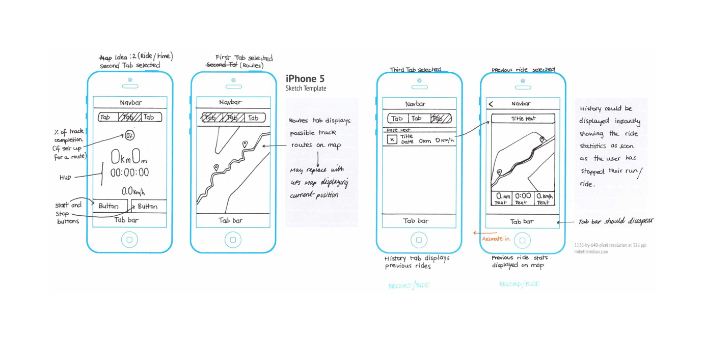
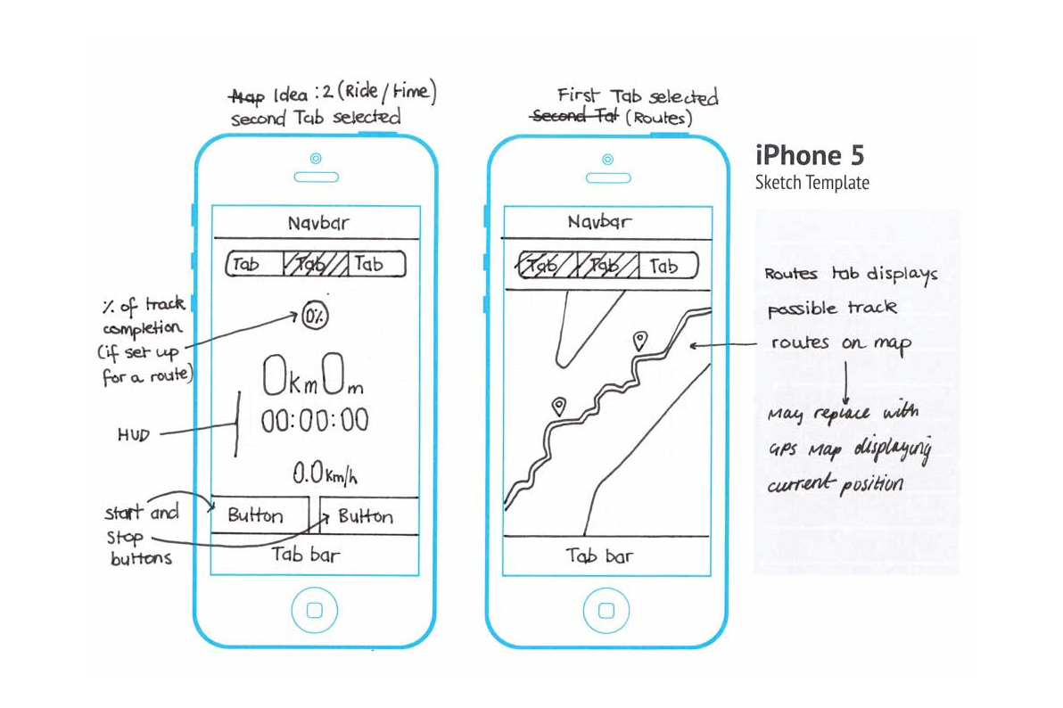
Once the user journeys were drawn out, I created a low-fidelity prototype to validate the designs in user testing.
I went out and recruited members of my local mountain biking club to test the prototype, which provided insights into their thoughts and behaviours.
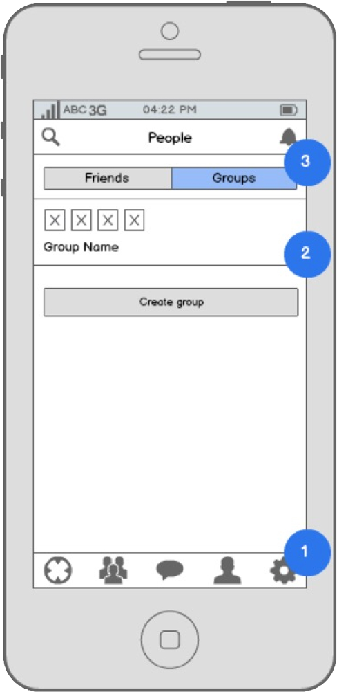
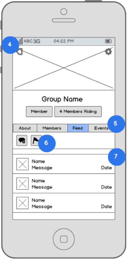
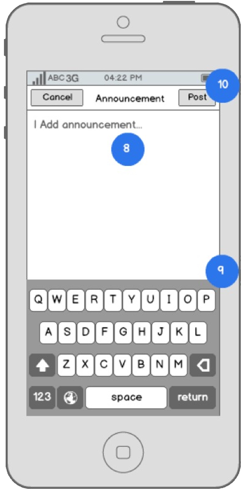
Recommendations for improvement gathered from the first round of testing informed a second design iteration.
I added labels to affordances and navigation items to improve learnability. Varied styles for tab elements and call to action buttons were also rethought to reduce confusion when trying to find group pages.
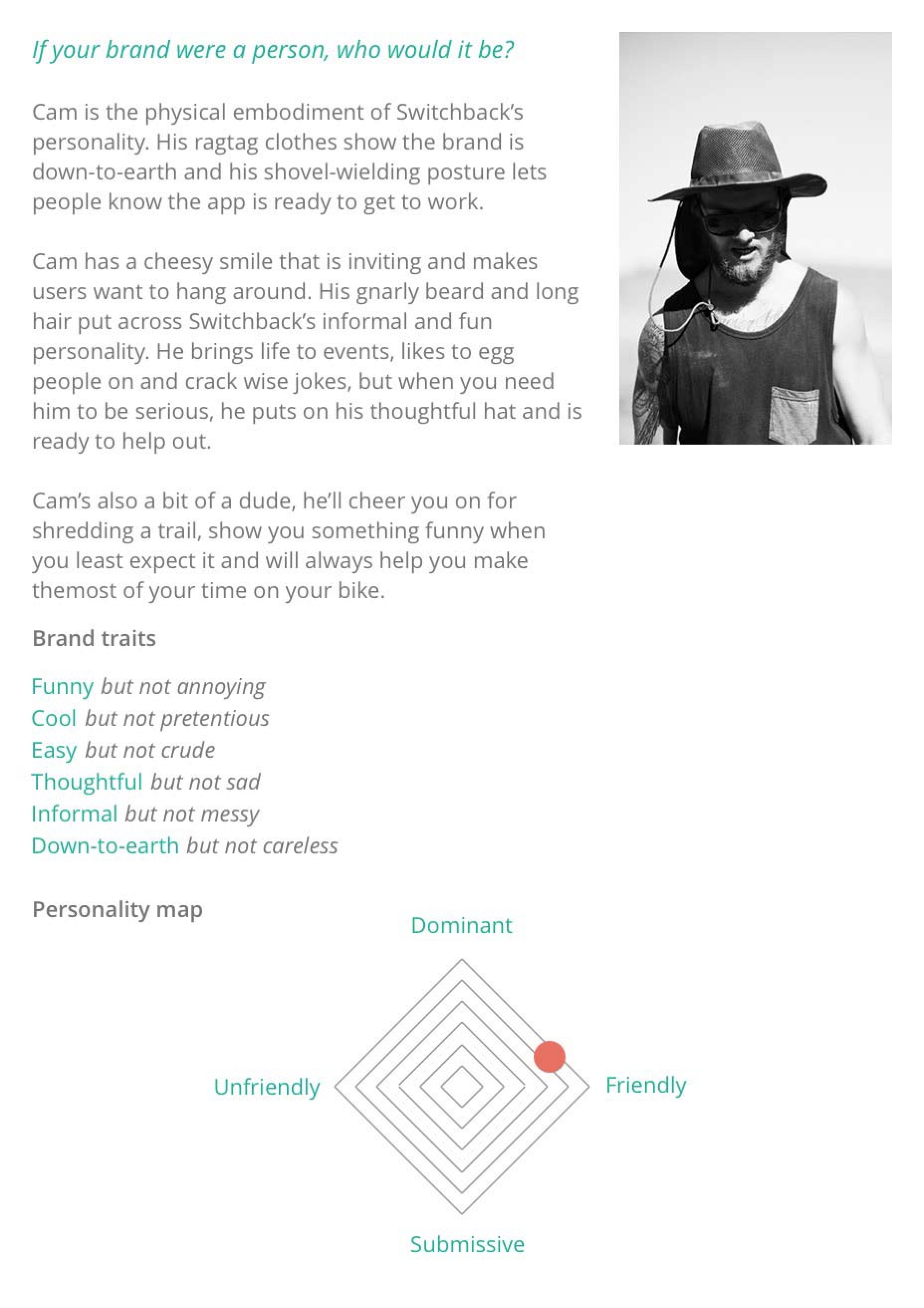
During this stage, I began adding further design detail using a design persona.
A Design persona is an archetypal character designed to be like-minded to the user personas.
If a design persona is incorporated into a design successfully, the user will feel like they are interacting with a friend when using the app.
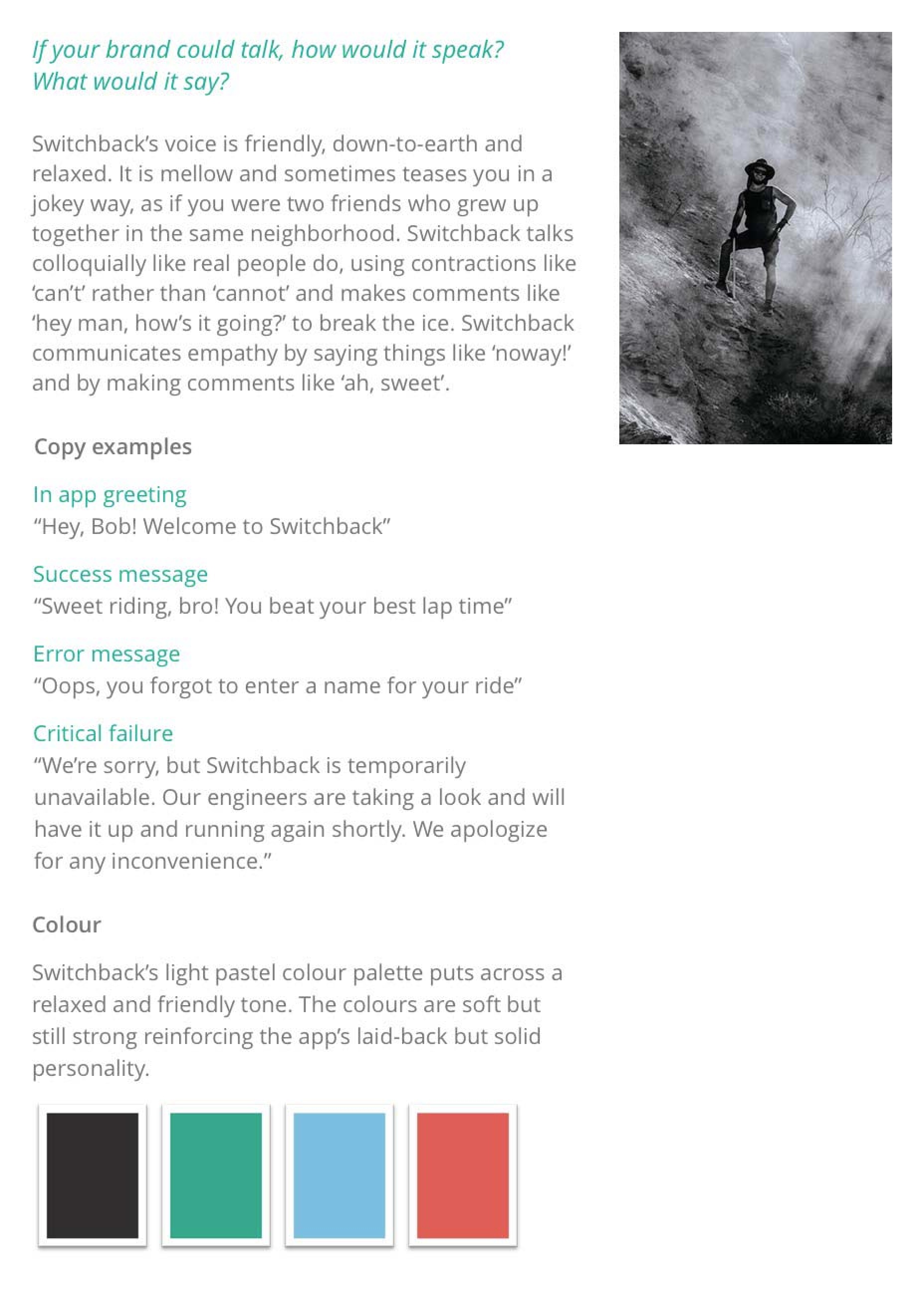
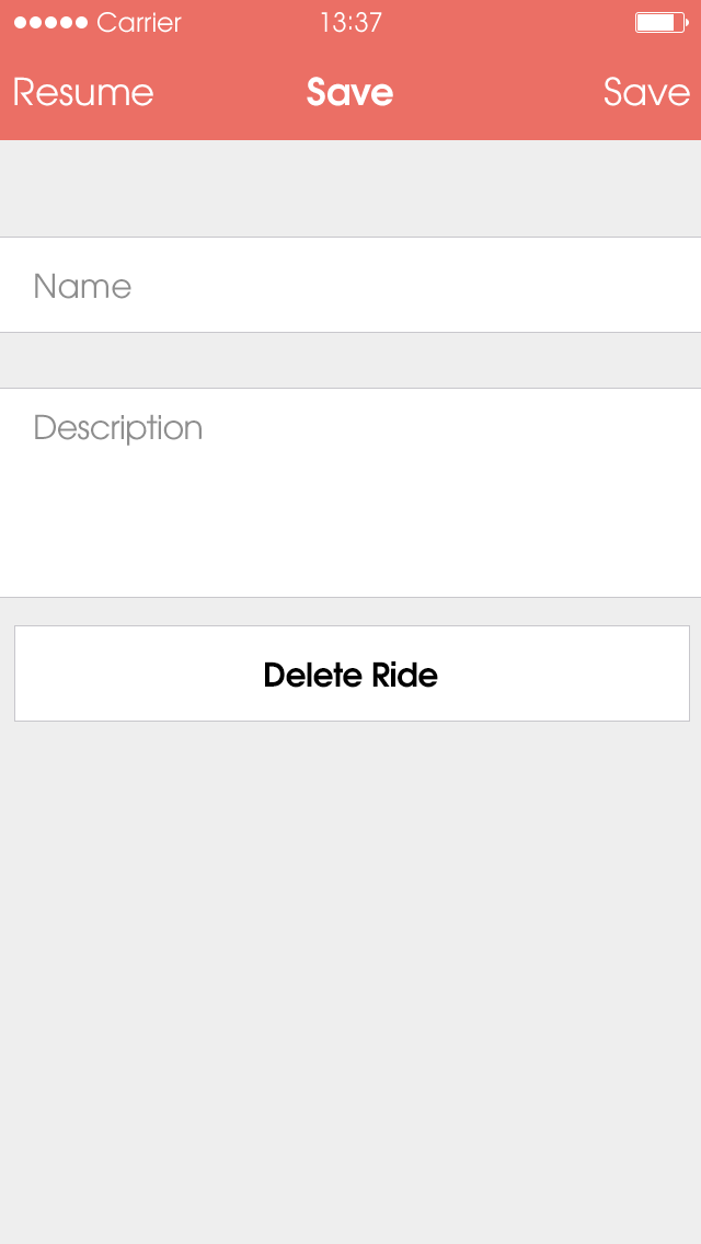
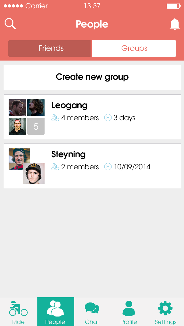
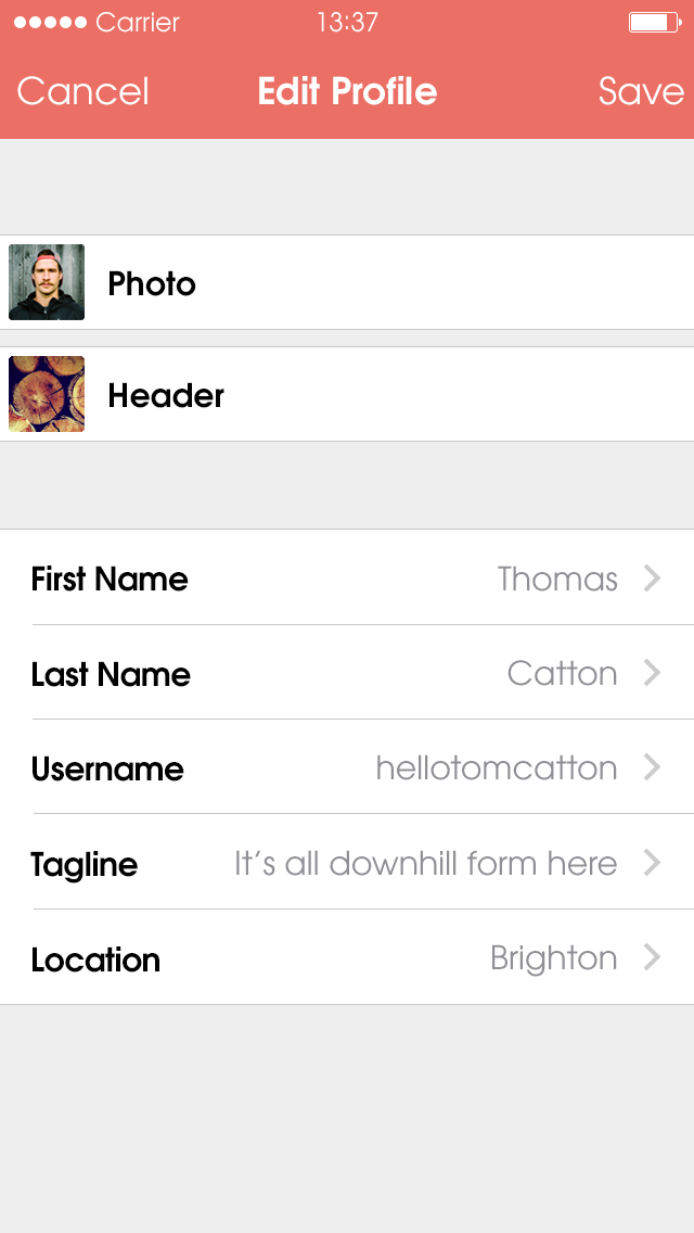
Building out high-fidelity mockups in line with the second round of designs set the art direction and added personality to the app.
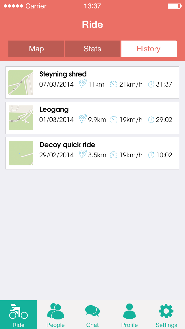
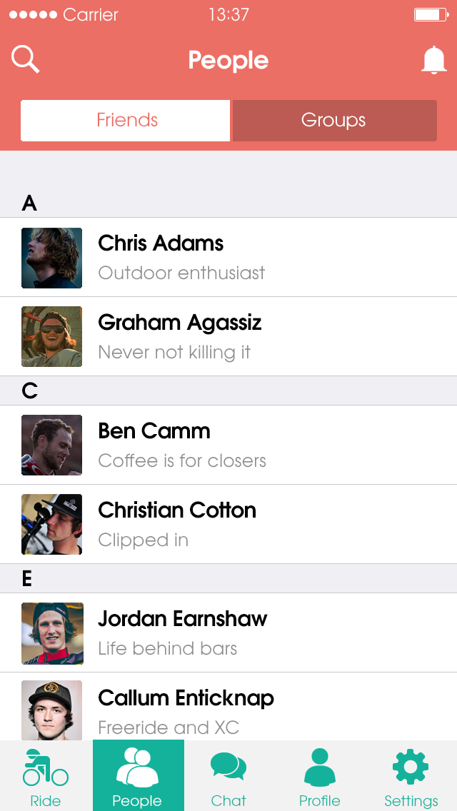
Finally, I built the app using a hybrid web app framework which allowed me to deploy web technology onto native mobile platforms like iOS or Android.
Members of the mountain biking community liked the personality that came across in the designs and copy. Unfortunately, I wasn't able to validate if the designed solutions helped prevent trail closures.
If I had more time, I would have carried out the second round of user testing and passed through the user-centred design process once more to validate the solutions.